Would I fancy spending five days this August on an island in British Columbia with a load of type nerds, eating locally-produced organic food, going for walks, discussing approaches to type, having a bit of a swim and getting sloshed? Actually, yes, yes I would. And if I wasn’t so darn poor I would be, under the helpful instruction of Tiffany Wardle, Dyana Weissman and Dr Shelley Gruendler. Registration is still open (despite what the website said at time of posting this), so go look at the website. Peace.
Sometimes I simply adore being European.
Off to Buffalo in July? You need to know what is what.
My grey one has a little stain on it that no-one but me can see. The navy one is a tiny bit too small for my belly. The red one’s white type is coming off, and has a million tiny holes in it, one for each time it’s been washed. Won’t you design me a new Typophile Tee?
Yes, it’s time for another installment of A Brief History of Type over at iLT. This, the fifth edition, looks at the Slab Serif. Next up, the Sans Serif. Stop reading this and go read that.
Ralf Herman’s assessment of the typography features in the new Firefox 3 is much like the Curate’s egg - good in parts. The comparisons are based on the Mac platform in this instance, please note. I’m always surprised at how Safari hasn’t developed its handling of type as much as I’d have hoped for, and I’d be interested to see how it and Firefox, on both platforms, fares against Microsoft’s eponymous offering.

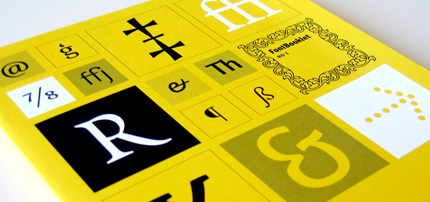
FontShop is offering residents of the BeNeLux countries a nifty new specimen, FontBooklet 1. Unfortunately, it is only available to the BeNeLux countries as a special concession to the Europeans most likely to be faced with climate change induced flooding. The specimens are designed to repel water, and can be used en masse to repair dike walls.
Four years after their first stab, P22 is back with another set of playing cards featuring 52 of their fonts. Yours for ten bucks (plus shipping), or free with purchases over $100. $10 for a pack of cards, that seems steep, unless they send me a pack for free, in which case it represents outstanding value for money.

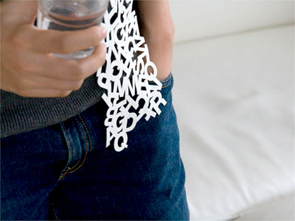
There have been loads and loads and loads of type t-shirts, almost entirely in Helvetica, mentioned on loads and loads and loads of blogs recently. I tire of them. This, however, is somewhat neater. Microfibre suede laser die cut scarves, in uppercase, lowercase or numerals. If only I were a) a lady, or b) more secure in my masculinity.

Fountain has released Rui Abreu’s Orbe, a blackletter face that means to interpret Portuguese calligraphy. It also marks the first OpenType release from the hairy Swedish foundry, and so it’s naturally replete with nifty ligatures and CE character set. Best of all, check out that nifty little promo video. Slick!
Early registration for TypeCon2008 ends tonight, so if you want to save yourself $40, you better be a bit sharpish.
Nifty background helper application PopChar has today been upgraded to version 4. If you work with text in print or web, it is useful, go explore.
Aegir at the Ministry has been at it again with his pesky beziers. This time, he's been building upon his earlier Polish stamps by expanding into Israeli ones. What he probably doesn't want you to know is how long he takes doing these things so that they are just so. He spent most of the weekend on these three, punctuated only by beer, coffee and sleep.
Underware have a limited edition of 100 numbered posters for sale at €80. Six colour silkscreen printing in Pantone and glow in the dark, nice. If you haven’t already worked it out, move your mouse between Day and Night above. The press release on Typophile reports that the poster comes free when you buy the full Underware collection, but I can’t find reference to that as an option on the Underware site itself. I might be missing it though.

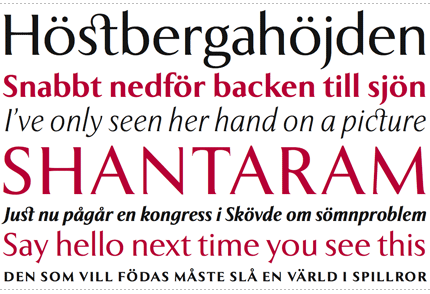
Göran Söderström from Sweden (you’d never have guessed, right?) wants you to know that his smashing new family, Exemplar Pro [PDF], is available from PSY/OPS now. Oh, and naturally that specimen is available in Swedish too. Börk börk!
A good piece on the web need not be long, but it can seemingly effortlessly engage, inform, and make one feel a certain way. I like that blend of warm, happy and inquisitive, maybe twinged with a gentle jealous admiration. So my question is this: Will you get equally fuzzy feelings reading the H&FJ blog?
Oh look! David Berlow has designed a new version of ITC Franklin.
June 11th sees the launch of Extensis’s Universal Type Server, that you may remember was shown in January at Macworld Expo. It is designed to replace the Font Reserve and Suitcase server products, which does seem like a sensible approach for Extensis to take, certainly for their own development needs.
New features include such marvels (if they work) as automatic font classification, family grouping, dynamic smart sets and shared sets. It isn’t cheap – a license for up to ten seats will be $1395 (classed as “lite”), before jumping up considerably, with a 15 seat studio expecting to shell out $4275. I guess that is why they chose to label it as professional and corporate.
To be honest, it is unlikely I will be in a position to test this in any meaningful production environment, however, I’ll keep you updated on other people’s impressions.
MS Typo News has this little gem online today: “The typorati may not like this, but science is science.”, relating to some study in Michigan that claims that the easiest typeface to read on instructional work is Arial. Yeah, whatever, but seeing as we’re on the subject of “Science is science”, let’s ask the following questions. Think of it as peer review:
- How many typefaces were compared?
- How many of those typefaces were sans-serif?
- How many of those sans-serif typefaces were not part of the standard complement of typefaces provided by Windows?
- Have you ever heard of the phrase, “you read best what you read most”?
- How many of those typefaces were sans-serif?
Yves Peters reports from Typo Berlin 2008, and by reports, I mean reports, as a reporter!
Apologies for RSS feed subscribers who may have received a long list of old posts from a few years ago. My own fault for experimenting with new software. Needless to say I have slapped my own thighs and given myself a stern talking to.

