I blabbed on the other week about people without access to $3000 of computer hardware and software being able to get started for $300 instead, going the open source route. But is it really possible? Sure FontForge is there, but what about all the other steps before build stage? Scanning, cleaning-up scans, tracing the resulting bitmap and then cleaning up those traces? I’m on vacation, so let’s have a really quick try. Just a few characters. Just for fun. Just open source.
For quite a while I have been considering making a titling typeface based on the site’s logo. Should’t be too hard, it’s just a cropped and tweaked version of Didot after all. I set a through z in Photoshop on my Mac, cropped and printed the result to get closer to a real-world example, starting as many of us do, on paper. Then into Ubuntu 8.04 I went. There are some screenshots below in a needlessly silly Flash widget thingy below to illustrate my efforts.


So, scanning. Well, the standard solution is XSane, and most desktop-centric distributions of Linux have it installed; Ubuntu is no different. The software was pretty straightforward to use, no great surprises, and a very large range of scanners are supported without the need for manufacturer’s proprietary drivers.
Next, that scan needs a little general cleaning up, and I had foolishly let some of those characters touch in the setting. Into The GIMP to fix things up. I despise The GIMP. I am sure it is very good, but having used Photoshop now for about half of my whole life (since version 2.5), trying to get my head around a different way of working is painful. The GIMP is powerful, but really, why do I need to tell it to specifically float a selection in order to move it. Bunch of crap. It does the job, but it isn’t pretty. I guess if your annual income is $12,000, you’d push past annoyances like that though. I saved the edit as a TIFF and move onto the next stage. It is time to trace.
Inkscape is a vector editor that uses SVG as its native format. How very web 3.0. It is also the quiet star of the open source graphics world. I used to be a Macromedia Freehand man, but as that application, and the investment in my license for it, slowly died through Adobe’s takeover, I was left with a problem. I couldn’t afford Illustrator, even at the knock-down price it is available to for Freehand owners, so I needed to check alternatives. After playing with demos of various cheap Mac packages, I came across Inkscape. It is a very very capable vector editor, doing much what you would expect it to do if you’re coming from either of the two main players. But while Inkscape may feature remarkably powerful capabilities, it has problems too. Don’t think you’re going to use it as a cheap page layout option as Freehand was so adept at, as is type handling is pretty ropey, and its colour models need heavy work. But we are here to trace a bitmap, and edit those curves. It did so with aplomb. The trace was reasonable considering the very low res scan (as with any tracing algorithm, the higher the resolution of the image, the better you will be able to control the final quality), and the editing tools were comfy like old slippers. It likes SVG, so let’s save it off as such.
Next, a quick build, and that means FontForge, the ugly ducking of all software on the planet. Now, that needs an article all of its own.
For quite a while I have been considering making a titling typeface based on the site’s logo. Should’t be too hard, it’s just a cropped and tweaked version of Didot after all. I set a through z in Photoshop on my Mac, cropped and printed the result to get closer to a real-world example, starting as many of us do, on paper. Then into Ubuntu 8.04 I went. There are some screenshots below in a needlessly silly Flash widget thingy below to illustrate my efforts.


So, scanning. Well, the standard solution is XSane, and most desktop-centric distributions of Linux have it installed; Ubuntu is no different. The software was pretty straightforward to use, no great surprises, and a very large range of scanners are supported without the need for manufacturer’s proprietary drivers.
Next, that scan needs a little general cleaning up, and I had foolishly let some of those characters touch in the setting. Into The GIMP to fix things up. I despise The GIMP. I am sure it is very good, but having used Photoshop now for about half of my whole life (since version 2.5), trying to get my head around a different way of working is painful. The GIMP is powerful, but really, why do I need to tell it to specifically float a selection in order to move it. Bunch of crap. It does the job, but it isn’t pretty. I guess if your annual income is $12,000, you’d push past annoyances like that though. I saved the edit as a TIFF and move onto the next stage. It is time to trace.
Inkscape is a vector editor that uses SVG as its native format. How very web 3.0. It is also the quiet star of the open source graphics world. I used to be a Macromedia Freehand man, but as that application, and the investment in my license for it, slowly died through Adobe’s takeover, I was left with a problem. I couldn’t afford Illustrator, even at the knock-down price it is available to for Freehand owners, so I needed to check alternatives. After playing with demos of various cheap Mac packages, I came across Inkscape. It is a very very capable vector editor, doing much what you would expect it to do if you’re coming from either of the two main players. But while Inkscape may feature remarkably powerful capabilities, it has problems too. Don’t think you’re going to use it as a cheap page layout option as Freehand was so adept at, as is type handling is pretty ropey, and its colour models need heavy work. But we are here to trace a bitmap, and edit those curves. It did so with aplomb. The trace was reasonable considering the very low res scan (as with any tracing algorithm, the higher the resolution of the image, the better you will be able to control the final quality), and the editing tools were comfy like old slippers. It likes SVG, so let’s save it off as such.
Next, a quick build, and that means FontForge, the ugly ducking of all software on the planet. Now, that needs an article all of its own.

Historian, designer and übergeek (in the positive way) Jonathan Hoefler has posted a smashing piece on the humble ampersand; its history, etymology, and descriptions of notable examples from the H&FJ library.
I used to mock MyFonts. I haven’t mocked them for quite a while, with very good reason. This month sees their email newsletter sparkle once again, this time with an interview of Jim Parkinson by Jan Middendorp. Classy. Put down that Wacom pen, get yourself a nice cup of tea and some biccies, and read.
Yves has posted the second part of his tutorial on paragraph rules over on Unzipped. That is all.
Oxfam here in the UK have launched a new advertising campaign in what appears to be a shift away from the standard money-raising activities that people here are becoming increasingly immune (probably down to the chuggers - that wheeze has backfired) towards asking people to have a more lobbying and volunteering role instead.
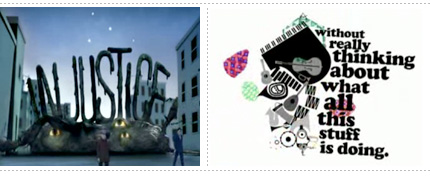
They want your time, not your cash (hmmm), and they are willing to use animated typography in conjunction with 3D characters and funky retro to persuade you.

They want your time, not your cash (hmmm), and they are willing to use animated typography in conjunction with 3D characters and funky retro to persuade you.
Yes, you all know about it, and it is even out there on YouTube if you can live with the naff quality and are not paying tax in the UK. But for those of you who are and didn't get to see it first time round on BBC Four (which is digital only), Stephen Fry can be seen exploring the history of the Gutenberg press tonight at 9pm on BBC Two. Sadly, it will only be available on iPlayer for another two days.
Over at iLT, part four of their “eXtreme” Typography Terminology series has been published. This edition: numerals and punctuation. Ahh punctuation.
Aegir over at the Ministry of Type has blogged on a rather unfortunate alternative reading of the Office of Government Commerce’s new logo. You couldn’t make it up.
Or get brutally murdered, apparently.
That is the title of the seventh annual St Bride Library Conference being held on the 15th and 16th of May here in merry London. Running with the caption “How do designers gain inspiration and how can we find more?” readers are reminded that the answer is most definitely not “Looking through old copies of Typographics”. Tickets are generally £100, £50 for concessions or £90 for Friends of St Bride Library. Amongst the luminaries will be Rian Hughes, Robin Kinross, Erik Spiekermann and Jeremy Tankard, so it might well be fun! I will be attending, under heavy disguise.
John D Berry has published a short piece on type designer David Berlow on Easily Amused, John's blog.
A Face to Face interview with Dutch designer Jos Buivenga, the man behind that most rare of things, a decent foundry offering decent typefaces. For free.
No, no no no no no. What I meant there was Problem solved for cynical corporation to force people to buy their bloated piece of shit office suite in the name of compatibility. Microsoft typography henchmen AscenderCorp will sell you those fonts you get in MS Office for the Mac so you can continue using Pages, NeoOffice etc instead of MS Office, but still maintain fidelity of typography with your MS Office using chums. Oh wait, there is a catch! If you're a home user, you can spend $150 on MS Office (with fonts) or pay $299 for just the fonts. Yeah, you read that right. And even if you're in business, MS Office costs $399. Those must be some nice fonts, as they represent an astonishing 75% of the cost of Office. Does that mean Microsoft is admitting that Office is just a hundred dollar app all along? And how come you get those fonts for free if you download the free viewer software on Windows? Funny that. Honestly, I could spit.
My poor collection of Typophile t-shirts, no longer so vibrant, lettering degrading, little holes from being worn and washed way too many times. Soon, you may need to be replaced by something black and white.
Yves returns with a lovely new Bald Condensed, discussing Hubert Jocham's Voice family, and a little epiphany on the downside of reviewing type.
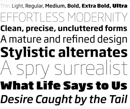
Seb Lester wrote in to let us know that his distinctive new family Soho Gothic has today been released by Monotype. The promotion page features what has to be the most elaborate animated 3D pun known to man. Or indeed, insect.
Over on Typographica, Christian Palino interviews Cyrus Highsmith, Font Bureau's senior designer. Moleskin sketchbook scans, type specimens, supporting YouTube videos, quirky questions at the end, it has it all. Hey, it must be Saturday morning, go read...
Along with possibly the finest description of a celebrity foodie known to man or woman (hence the headline above), Dean Allen over at Textism has a little tutorial in getting stuff out of that there fancy Character Palette in Leopard.
Awww. MacUser magazine here in the UK has a cover story this issue highlighting the top 50 Mac related websites, and a few design sites get a mention. Brand New, iLT and Typographer.org all make it to the list. Smashing! I feel I should subscribe or something.
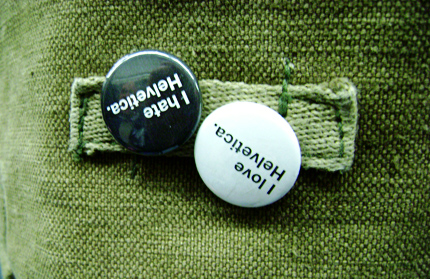
Jubilee Line, between Canada Water and Westminster, 9.00am, 11th April 2008. If you look closely you can make out the reflection of the confused gentleman sat next to me wondering why I was taking a photo of some random person's bag without their knowledge. And, of course, not saying anything.
Mr Hoefler on Adobe's designers, viniculture, and the character traits implied by kerning pairs.
It's late, I'm ill, so I'm going to be lazy and just post the news from their site: "Final versions of the two new Gentium font families have been released - Gentium Basic and Gentium Book Basic. Both families include regular, italic, bold and bold italic weights, with Gentium Book Basic being overall heavier than original Gentium. 'Basic' refers to the character set, which is limited to only basic Latin characters plus a variety of the most common extended Latin letters and diacritics."
Remember Textism, Dean Allen's fantastic blog from a few years back? It appears to have returned. Strange coincidence, just a couple of days after I stumbled upon his Twitter feed. Never heard of Textism? Then rejoice anyhow, because you are in for a treat, hopefully on a regular basis.
Yves has posted his new type quiz on the Unzipped blog, along with the answers to the previous edition.
Well, I think the headline pretty much covers it? Get the details from the horse's mouth.
A 26 year old graphic designer originally from Bangor has come up with the new designs for UK coins. The design is based on the Royal Arms and when the coins are arranged just so they make up a montage of the full coat. They're really, really fabulous. I particularly like how the 50p, 20p and 1p coins turned out.
Part of my dislike for April Fools is that I tend to be, well, trusting. No, don't laugh, it is why I get upset when I find deceit, whether in jest or otherwise. I foolishly assume everyone tells the truth until given reason to believe otherwise. I don't know if Jonathan Hoefler's latest blog entry is true or not, but it is such a ripping yarn I'm not sure I care.
Update: Trust Aegir to go off and set Shakespeare in it!
Update: Trust Aegir to go off and set Shakespeare in it!
After a while in private beta testing, FontStruct has been opened up to the general public today.
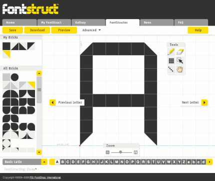
FontStruct is an online modular typeface editor from FontShop, by the way. It's pretty cool, go play!

FontStruct is an online modular typeface editor from FontShop, by the way. It's pretty cool, go play!
Wow, elaborate or what? I'm assuming it'll revert tomorrow. However, for today and today only, the Typophile homepage actually works on your iPhone...
No April Fool jokes around here, I'm afraid I'm one of those humourless types.
