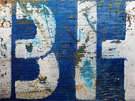
Yup, FF Meta Serif. And how handsome it is too. It's going to be everywhere. Everywhere.
I've been resisting doing this post for days, as I don't see the point until you can actually see them. I'm so excited! Today sees the launch of the new BBC Two television idents, and you can see them here (Warning: UK viewers see different content on BBC Websites - if you are outside our island and can't see them, please let me know). Set in Avenir and all very jolly. I have goosepimples!
Yves pointed me towards this YouTube clip. Awww. It must be time for the card manufacturers to invent a holiday to sell overpriced paper products to people in the post Christmas lull, using guilt masquerading as affection!
One year's worldwide exclusive rights to Letterbox's rather cute Bisque is to be auctioned on eBay. They're claiming a first, and I'll watch with intrigue.
New from everyone's favourite Swedish foundry: Jalapeno and Borgstrand Stencil by Martin Fredrikson, Eason by Randy Jones, and Anziano by Stefan Hattenbach.
Ed Arnold passed away on the 2nd of this month, aged 93. An obituary by his eldest daughter, Kathleen Loomis, has been released, and a set of reflections by Mario Garcia, Nanette Bisher, Richard Curtis and Phil Nesbitt have been published on the Society for News Design website.
David Carson is to speak at One Friday 2007, along with Daniel Eatock, Tom Evans, James Henderson, Rene Knip, Amelia Noble, Rich Roat and Jason Smith.
Roger Black has interviewed David Berlow on an alternative solution (sorry, contention) of on-screen antialiasing. Berlow proposes abandoning the conventional multiple master approach in favour of creating multiple versions of the same vector typeface, hand-optimised to specific type sizes designed on the pixel grid itself. More importantly he notes that the nature of the argument, ie, that one method is best, is to miss the point, and the graphic designer (and indeed the viewer) should be free to pick the method (Berlow's or otherwise) that is best for the design and particular viewing conditions themselves. It is interesting reading. Oh, and Roger, your website is darn pretty, but I'm not sure it needs to be 4 foot wide...
Lots of site news. We're out of beta. We at last have archives for the news and Bald Condensed columns. We've reprinted a selection of articles from the past. We rebuilt the code, navigation and dumped all the HTML tables to be more disabled accessible (this is Europe, my friends). Oh, and we have a bright new design. For fun. The design isn't perfect - there are problem with the RSS feeds that results in unfortunate direct article links and some garbled characters, which means the typography is simplified for the moment. RSS may be dumped...
Quick update on an earlier article, Burbank has now been released. That is all.
P-Type Publications have released Indie Fonts 3: A compendium of digital type. Twenty founderies are featured across over 400 pages of specimens, and it comes with a CD of 53 fonts. The designers are varied, including work from Jeremy Tankard, Nick Shinn, Jonathan Barnbrook and Rian Hughes. Our very own Yves wrote one of the introductory articles, Eight is not enough, in which he says "These catalogs do not pretend to be timeless, all-encompassing Bibles of digital type. No, they are fascinating snapshots of the current state of the type industry, and show who's actively furthering the craft and making valuable additions to the type canon today."


