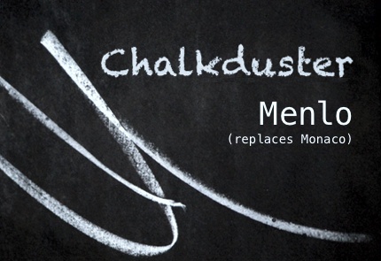
The latest version of Mac OS X comes with four new fonts. Chalkduster (a good attempt at emulating chalk on a blackboard, and sadly sure to become a firm and inappropriate favourite with lazy PowerPoint users for years to come), Menlo (a monospaced family based on Bitstream’s Vera Sans Mono that replaces Monaco for applications such as Terminal and code editors), Heiti SC and TC and Hiragino Sans GB.
On the technology side, there's also better support for bidirectional text, automated text substitutions system-wide (so, for example, typing (c) gets you ©), and you can now draw Chinese characters on your trackpad as an input method. Neat.
I know some people would have preferred greater emphasis on the typography side, but 10.6 is about bringing up the core technologies of Mac OS X up to speed with the transition to 64-bit Intel architecture. Things like the Finder being completely rewritten, improved multi-processor/core support with Grand Central Dispatch, and OpenCL, a technology that allows GPUs (the processor in your graphics card) to augment general computing tasks. These things are invisible, but important, and it is worthwhile remembering the upgrade cost is less than a typical decent typeface license in a single weight.
Fanboi bit over, now a bit of criticism. Sadly, granular control over the anti-aliasing settings for onscreen type have disappeared. You now just have the choice of LCD or CRT, with the light and strong settings banished to history. Why? Windows allows fine-tuning of ClearType settings, and this move by Apple seems regressive.
Know any more new type-related features? Let us know and we will add them here.
